Archive Record 06.Redesigning Linha Universidade de Aveiro (LUA)
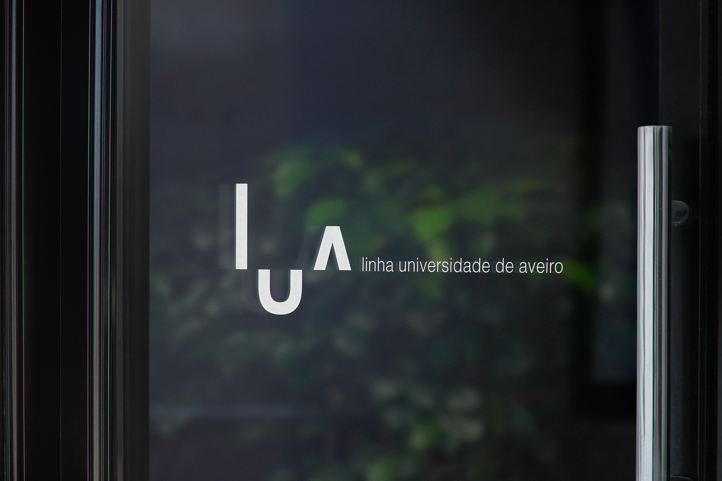
Redesigned and art-directed the visual identity and communication strategy for Linha Universidade de Aveiro (LUA), translating research into a cohesive visual system designed to make student support more visible, approachable and engaging.
Communication Design, Art Direction & Visual Identity
Client: Universidade de Aveiro
Role: Art Direction | Visual Identity | Communication Strategy | Communication Design
Scale: 17,000+ students
Project Type: Master’s Thesis / Service Identity
Date: 2023
Location: Universidade de Aveiro
Status: Under university’s development
Brief
Reposition LUA through a new visual identity and communication strategy that could better connect the service with Universidade de Aveiro students.
Goal
Create a clear, contemporary and approachable identity capable of communicating LUA's role while supporting greater awareness and engagement with the service.
Challenge
Transforming an outdated and inconsistent identity into a cohesive communication system that could balance institutional credibility with a more human, approachable and student-focused language.
Project
A complete redesign of LUA's visual identity and communication strategy, developed through extensive research into health communication, mental health, visual identity and student engagement.
The project combined strategic research, identity design and communication development, resulting in a visual system spanning branding, campaigns, physical applications, social media and digital communication.
Due to the extent of the project, the work is presented here as a condensed visual archive, focusing on the main design outcomes and selected explorations.

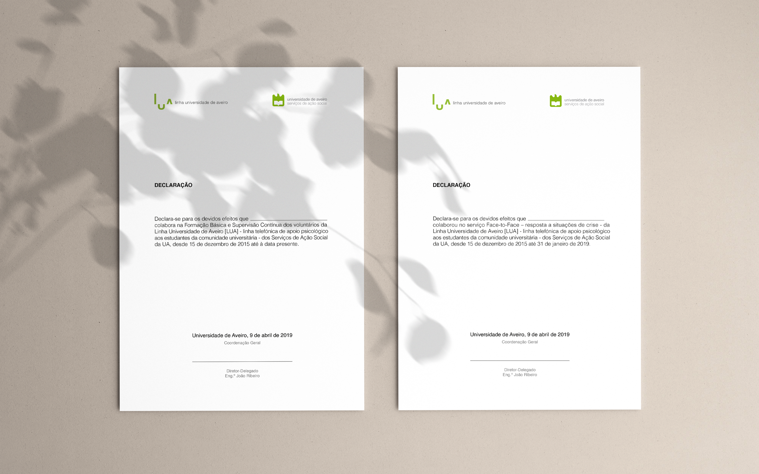

01 - Branding
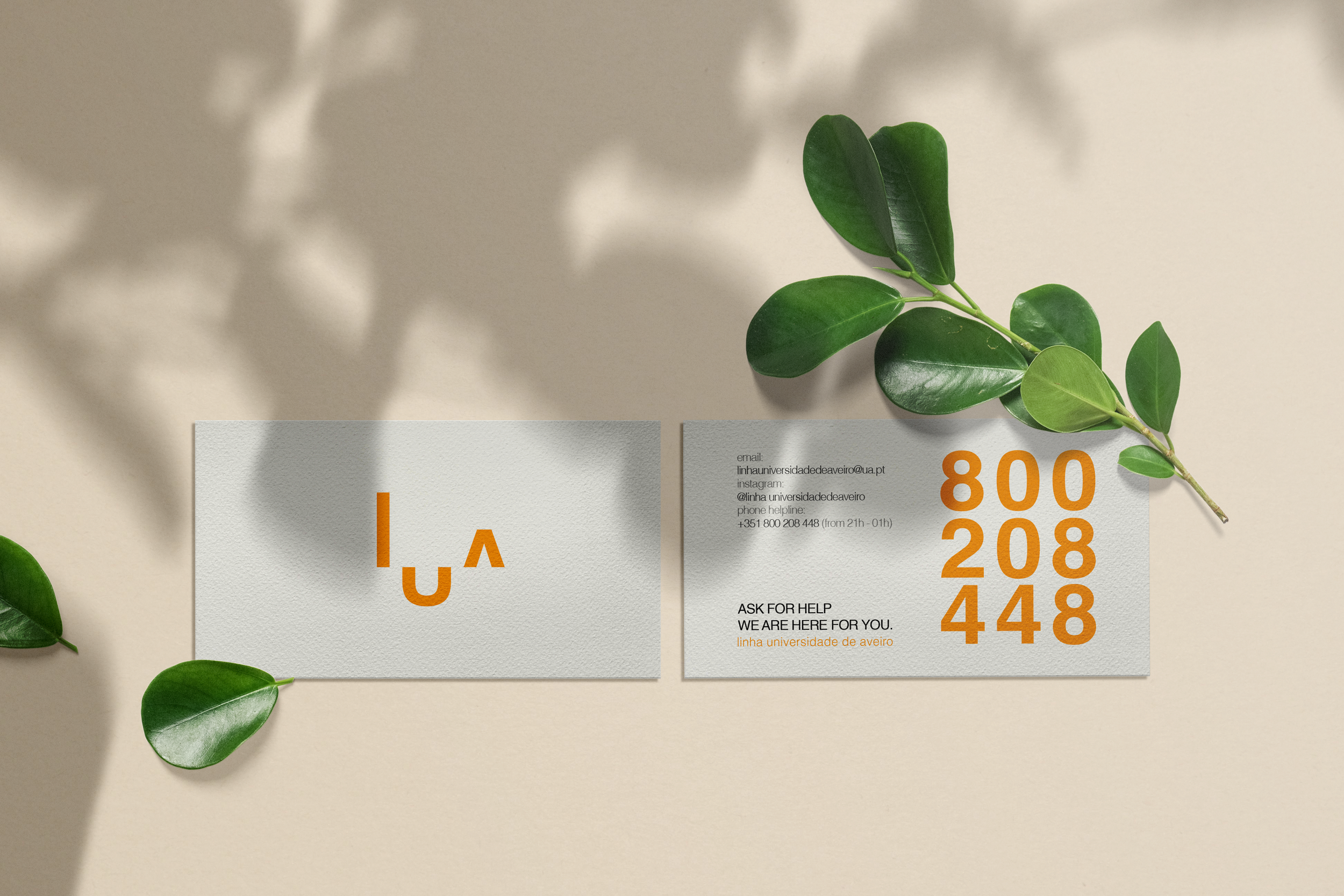
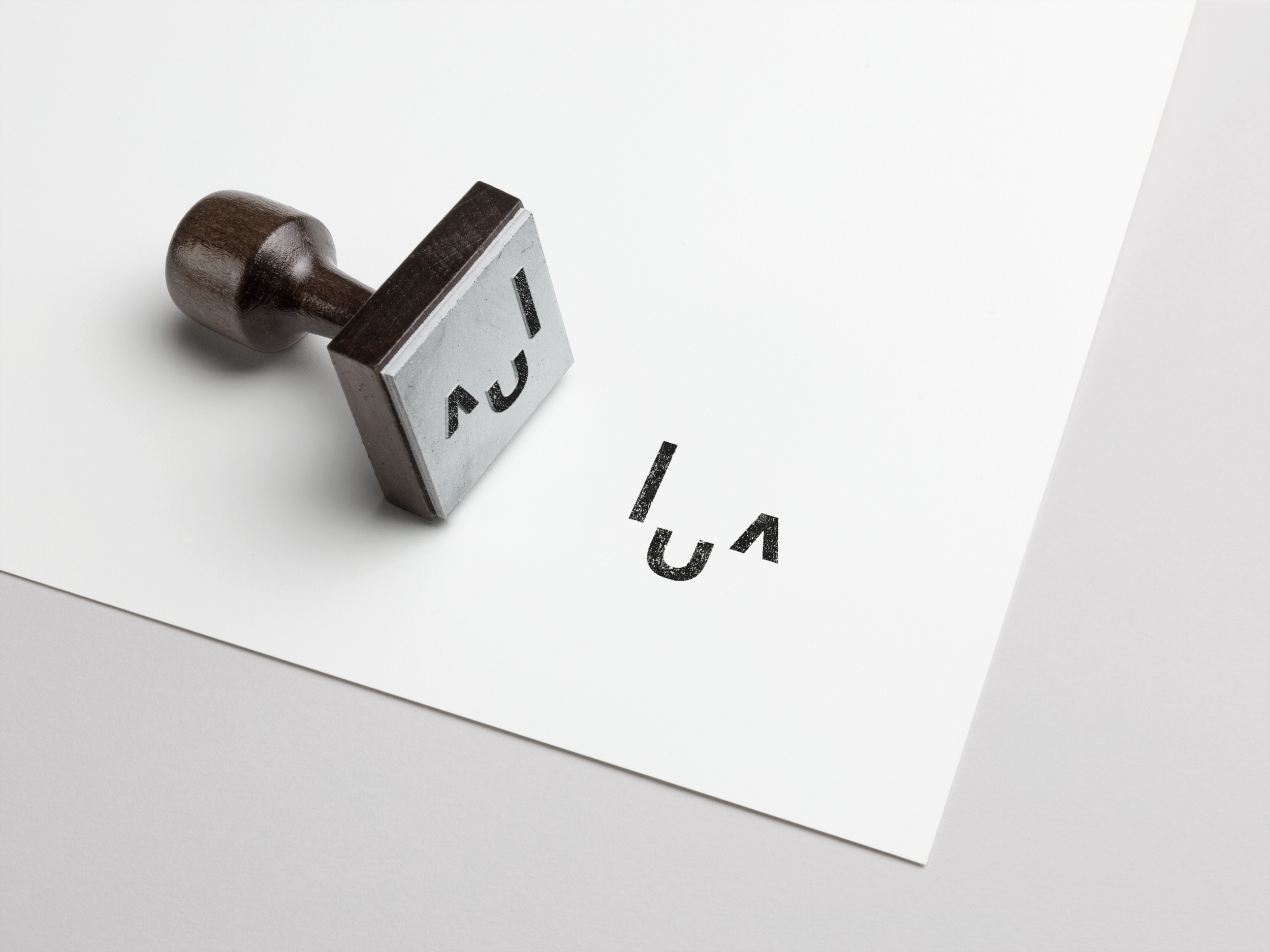
The identity was redesigned to create a more approachable, cohesive and versatile visual system, while maintaining a connection to the Universidade de Aveiro.
The development included:
Identity research & Case Studies
Logo redesign & Visual Concept
Typography System
Colour research
& palette development
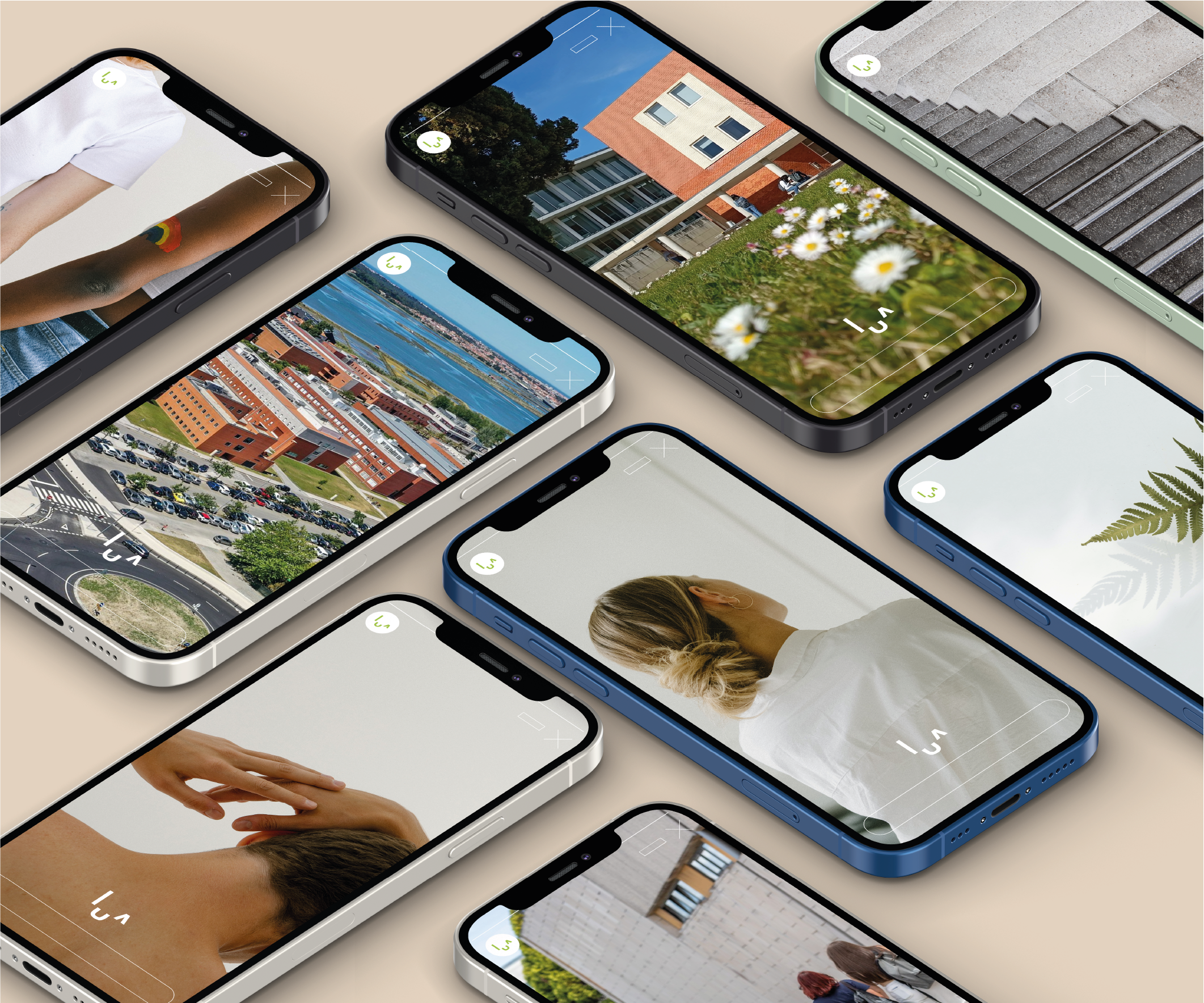
Photography
/ Image direction
Identity applications
Visual system
& usage guidelines
02 - Communication
The identity was then translated into a broader communication system designed to increase awareness of the service, promote mental wellbeing and create a closer relationship with students.
Awareness Campaign
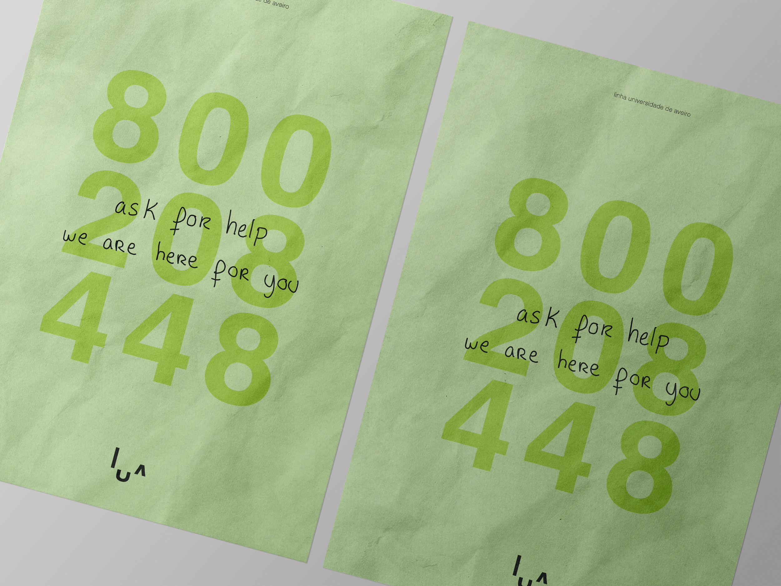
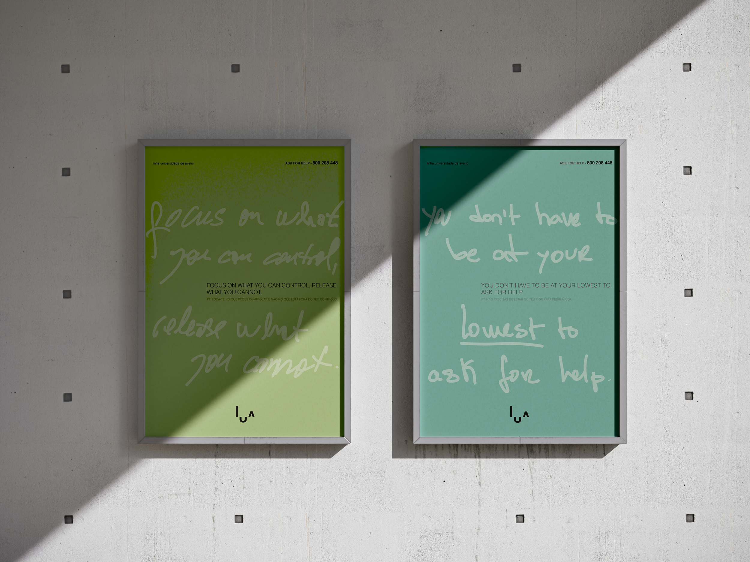
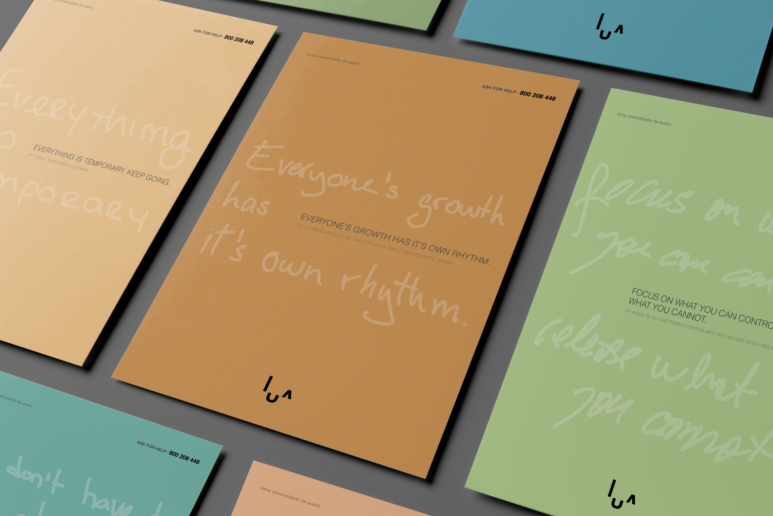
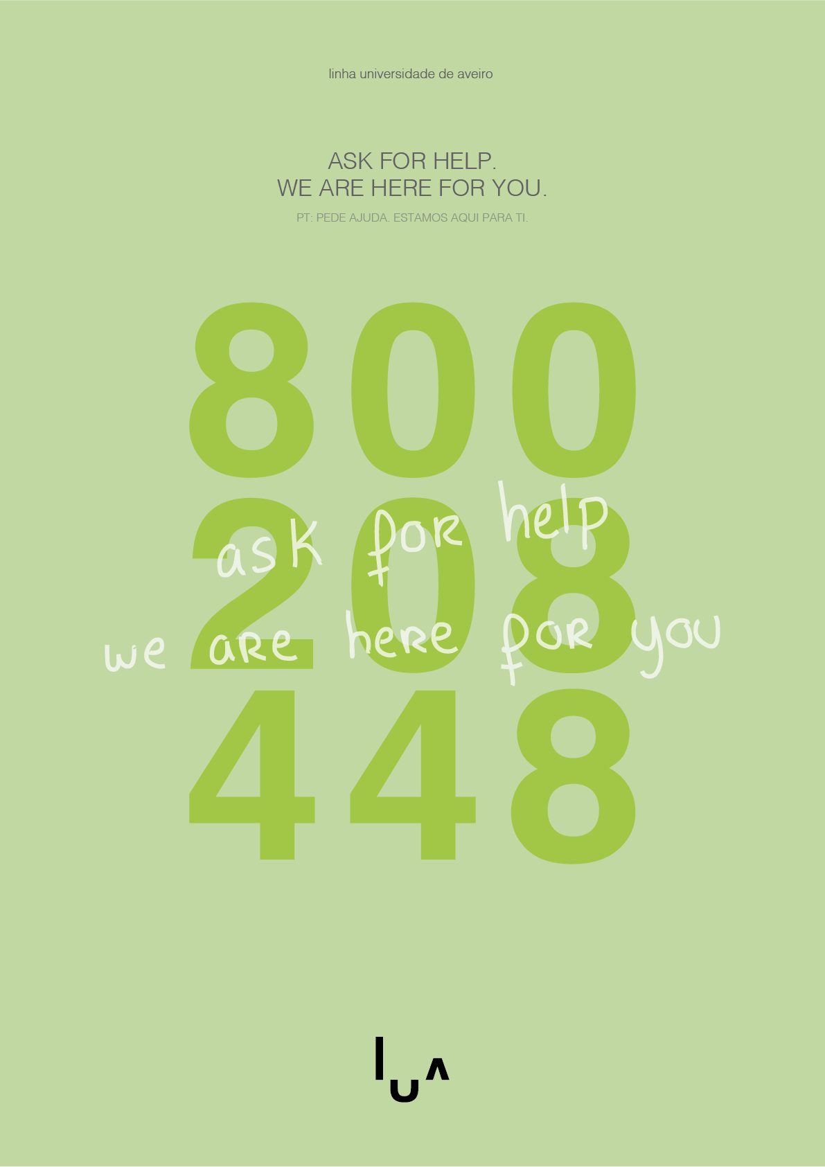
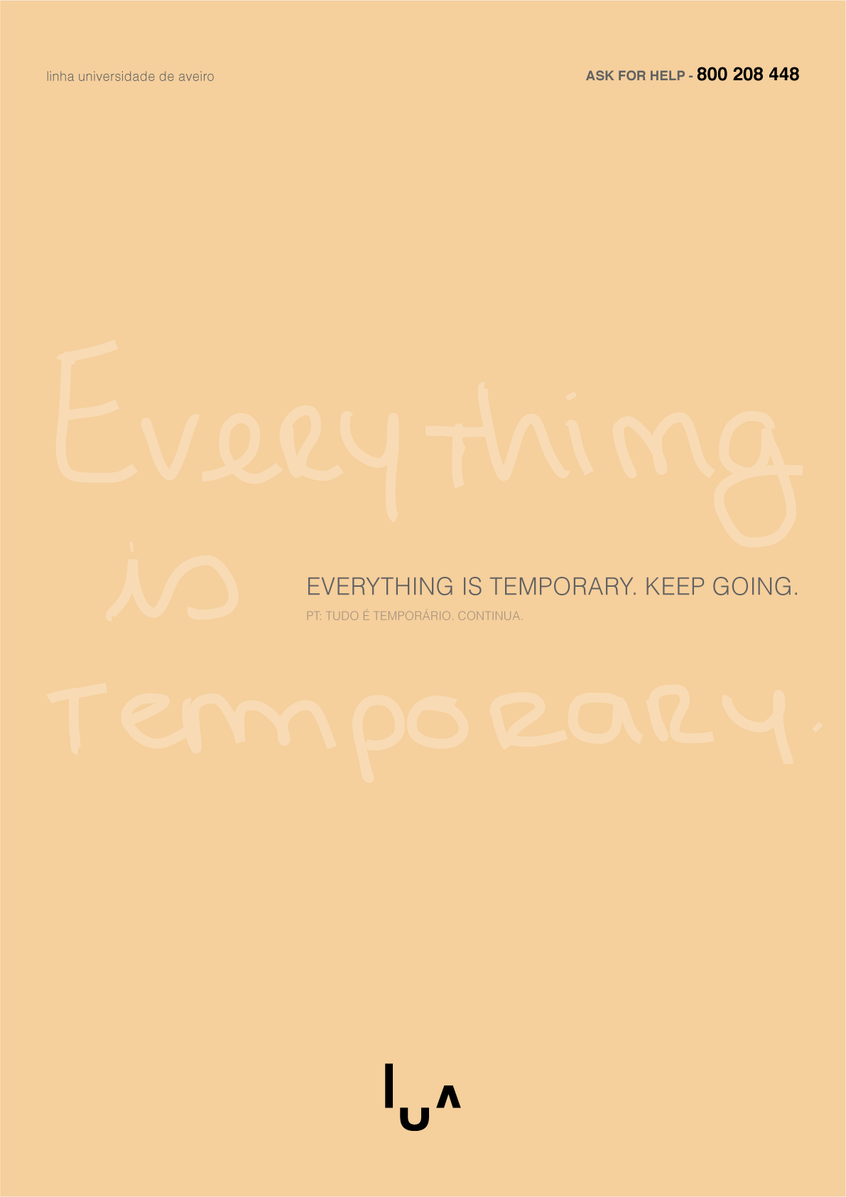
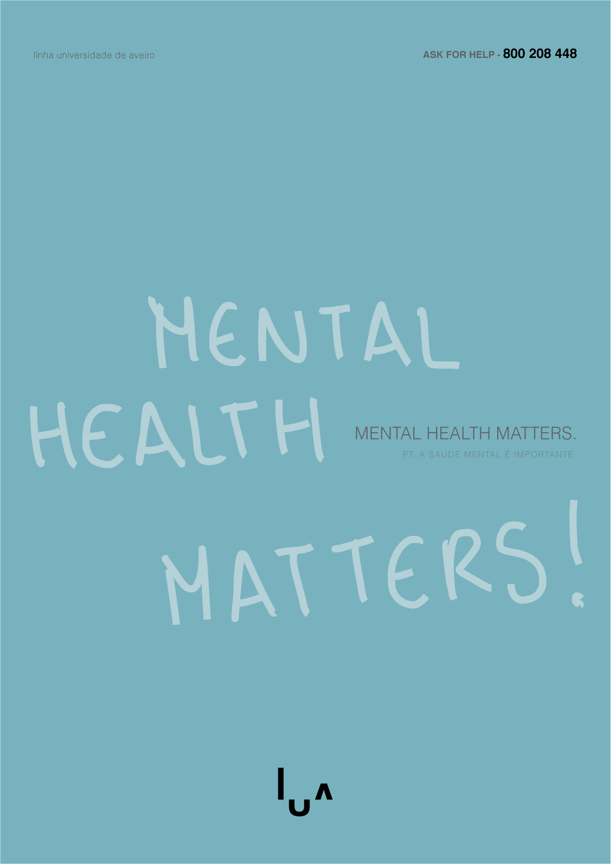
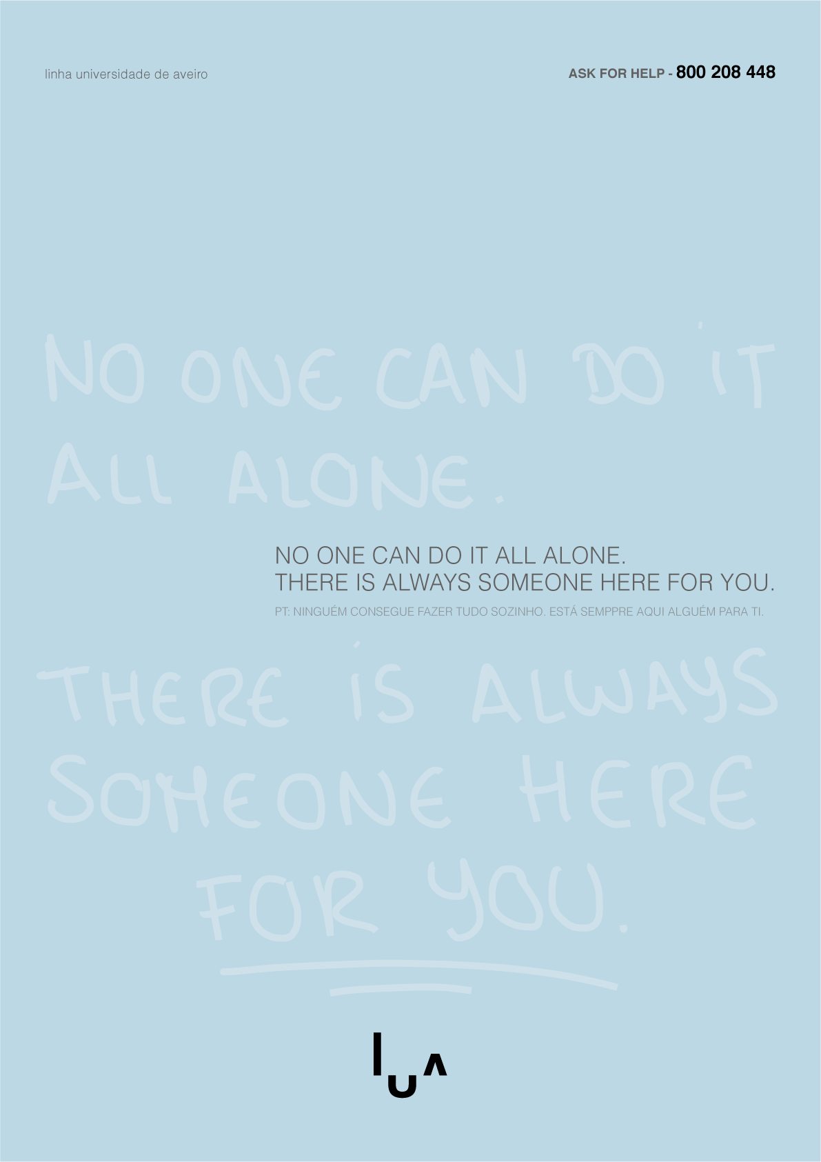
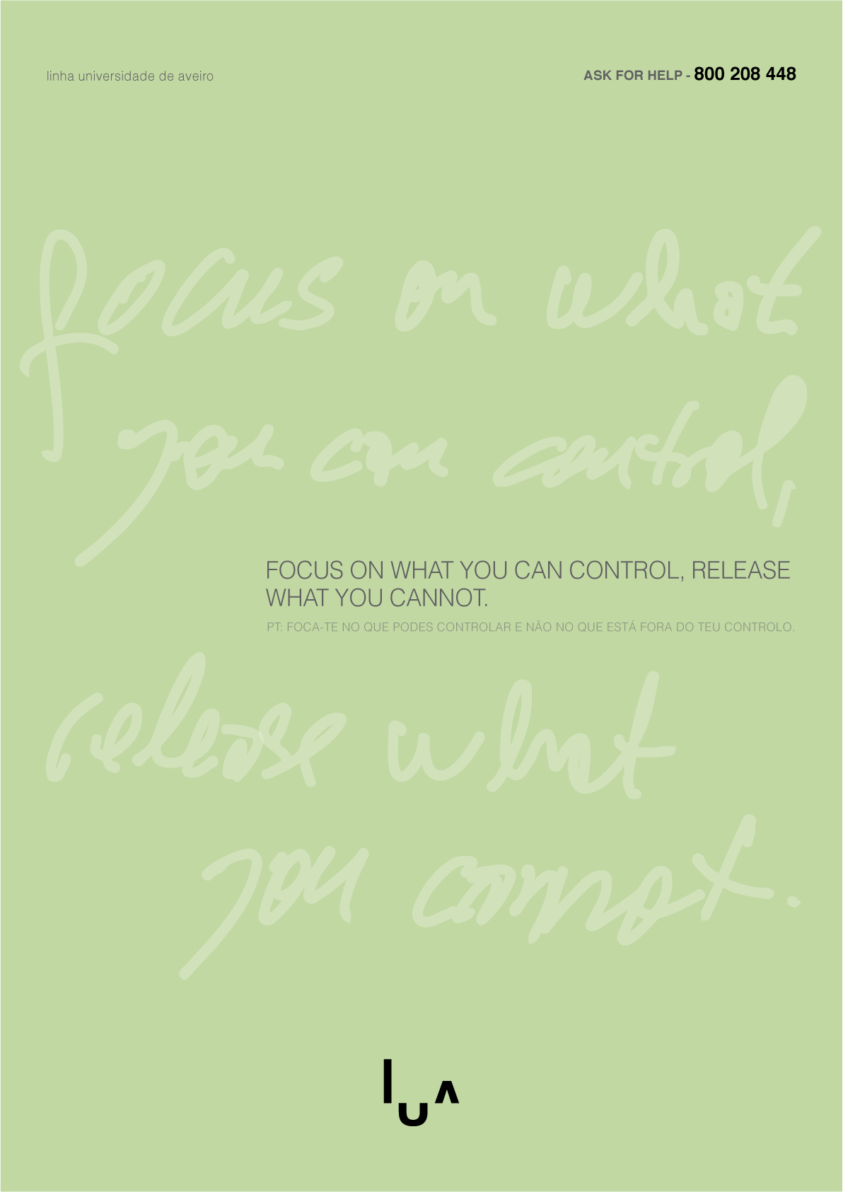
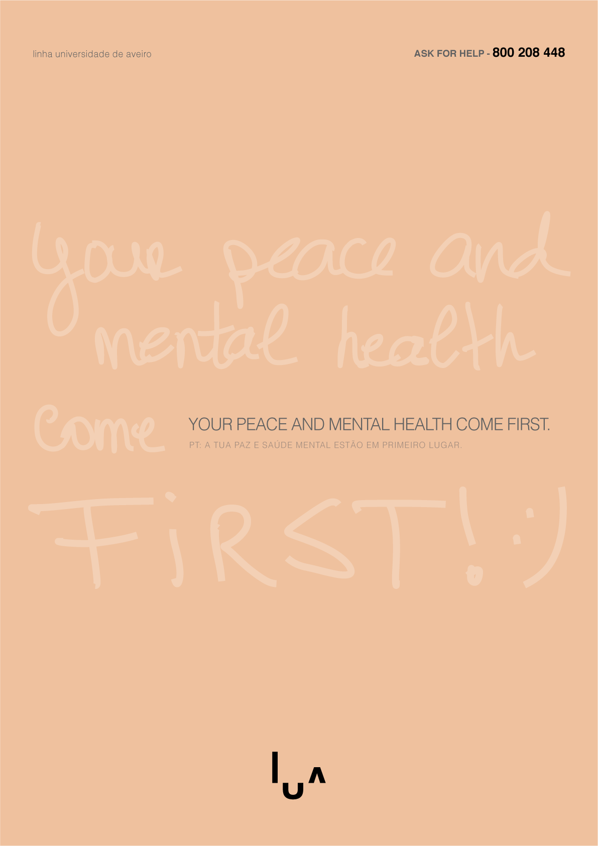
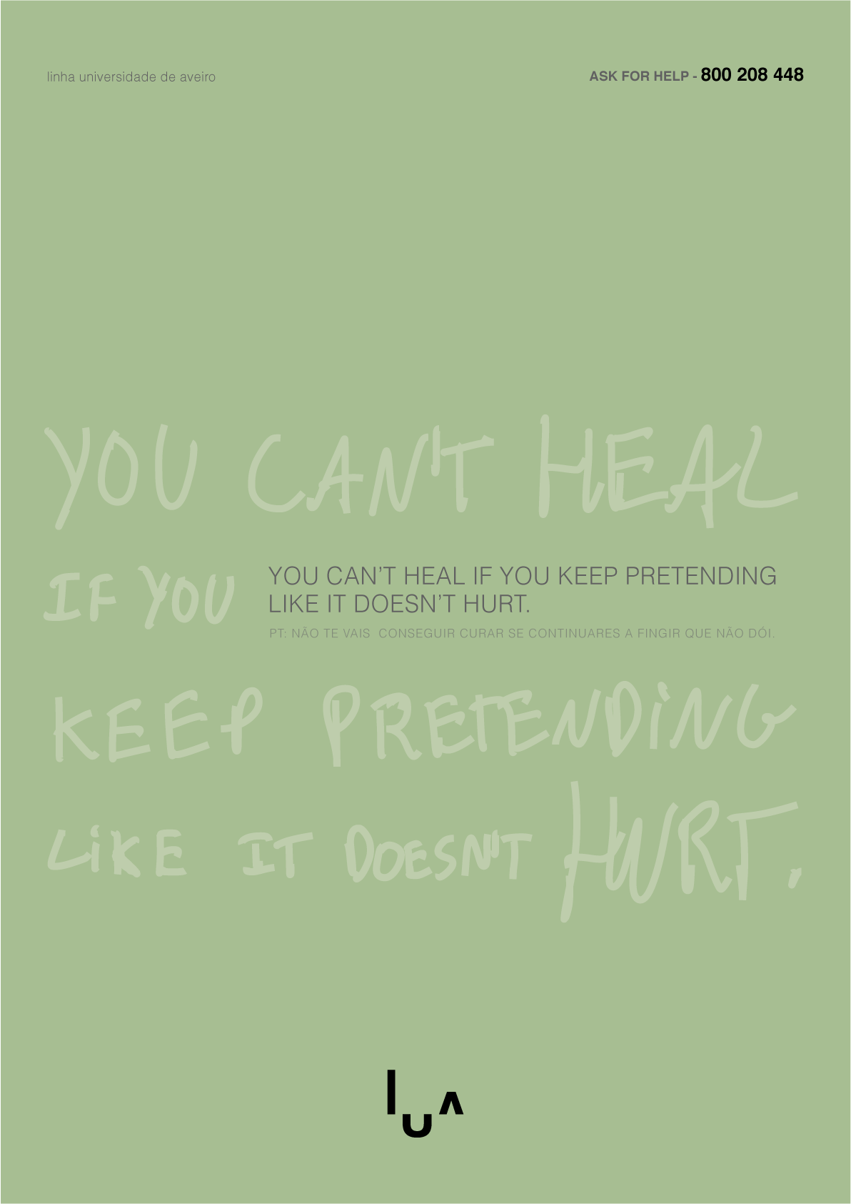
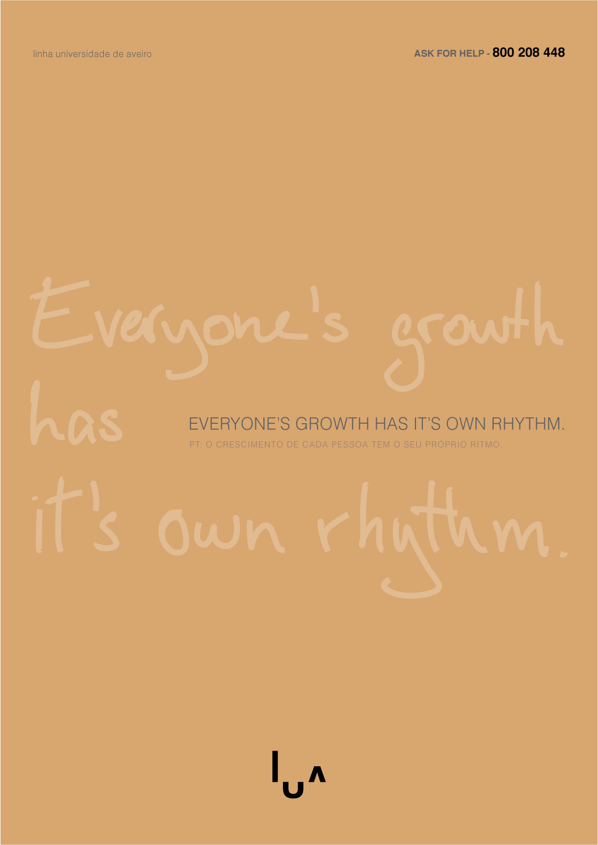
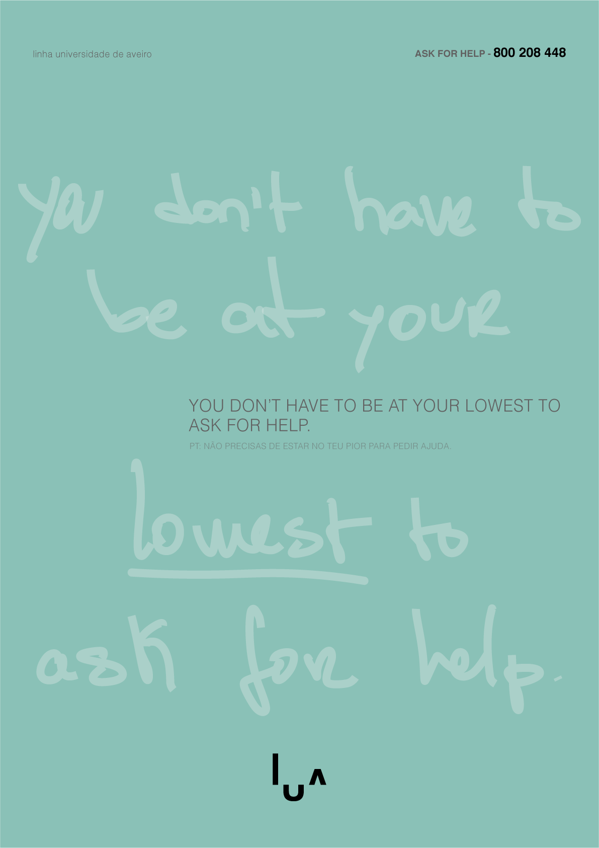
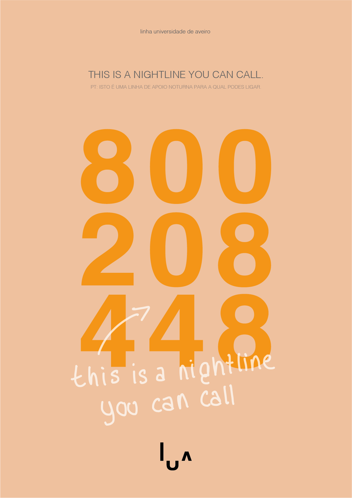
A series of eight posters exploring messages around mental health, support and self-awareness.
A key part of the process was the handwriting exploration: handwritten messages were collected from people of different ages and backgrounds, allowing natural variations in handwriting and expression to become part of the visual language.
The handwriting was ultimately used as a graphic and emotional element, while Helvetica maintained the legibility of the communication.
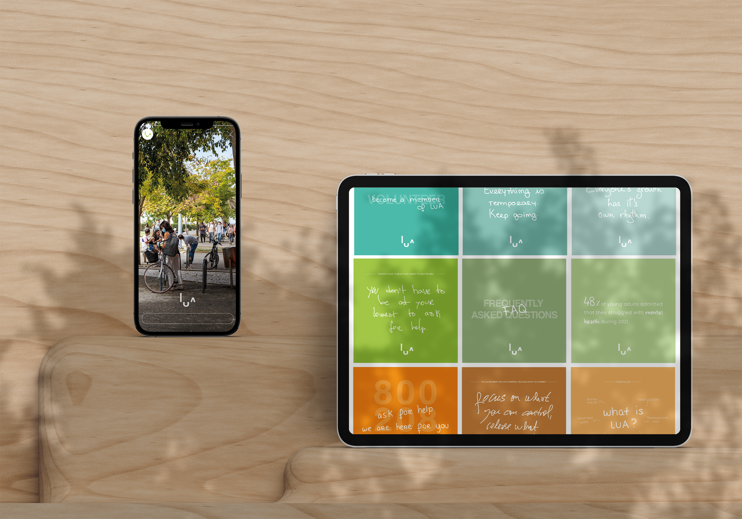
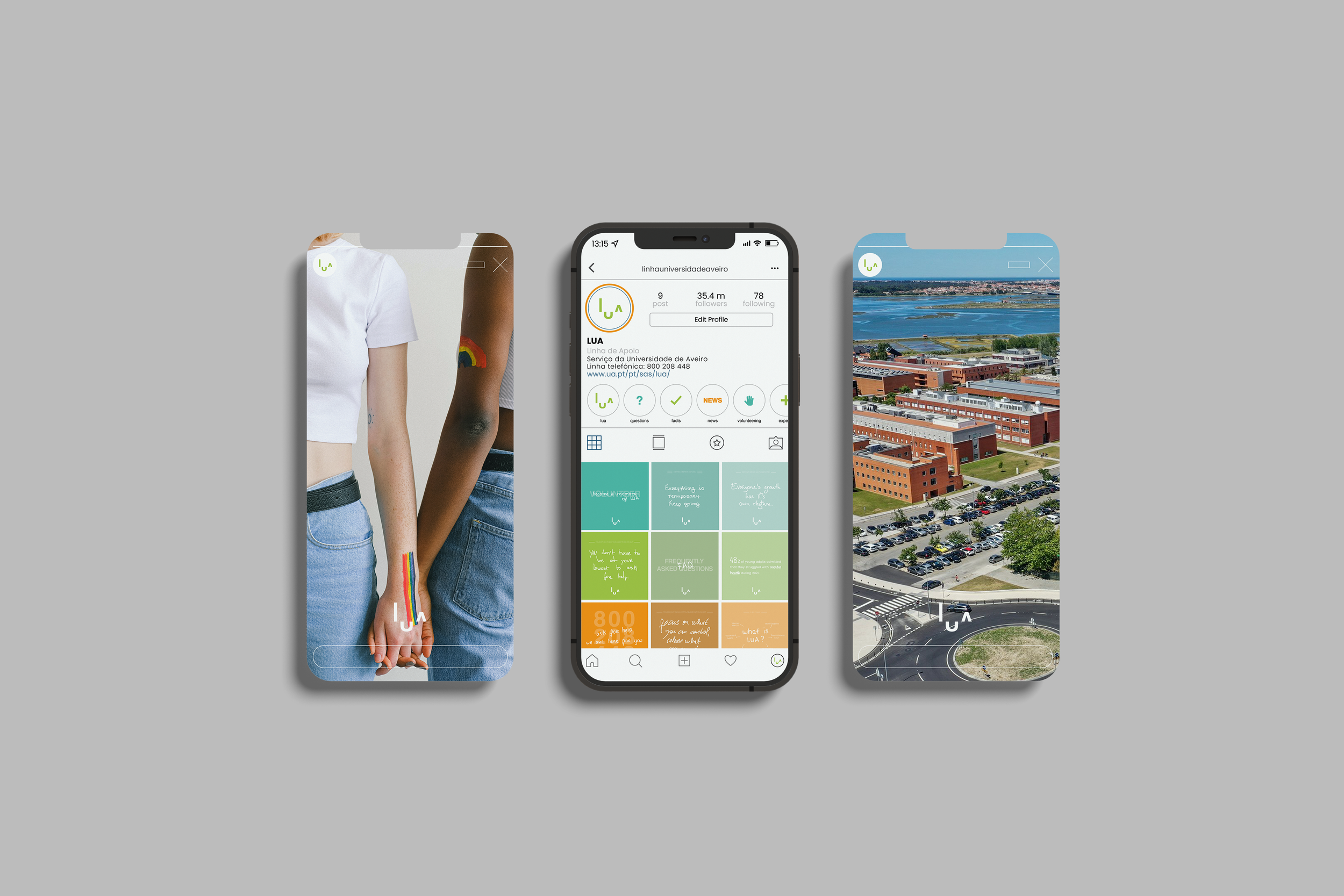
Communication System
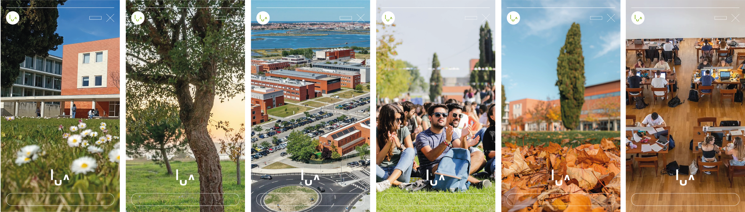
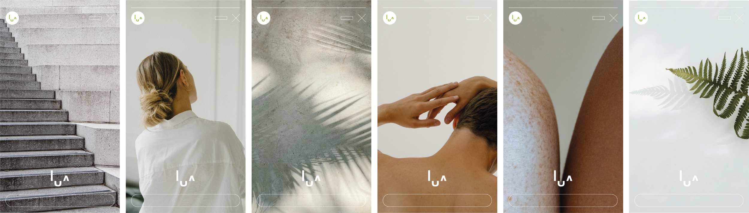
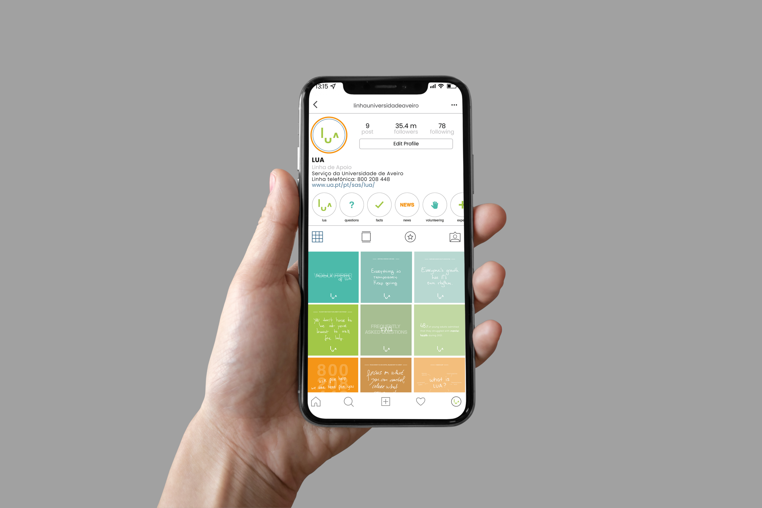
The same visual language was extended across:
Support-line campaign; Social media; Instagram stories & highlights; Institutional materials; UA website prototype.