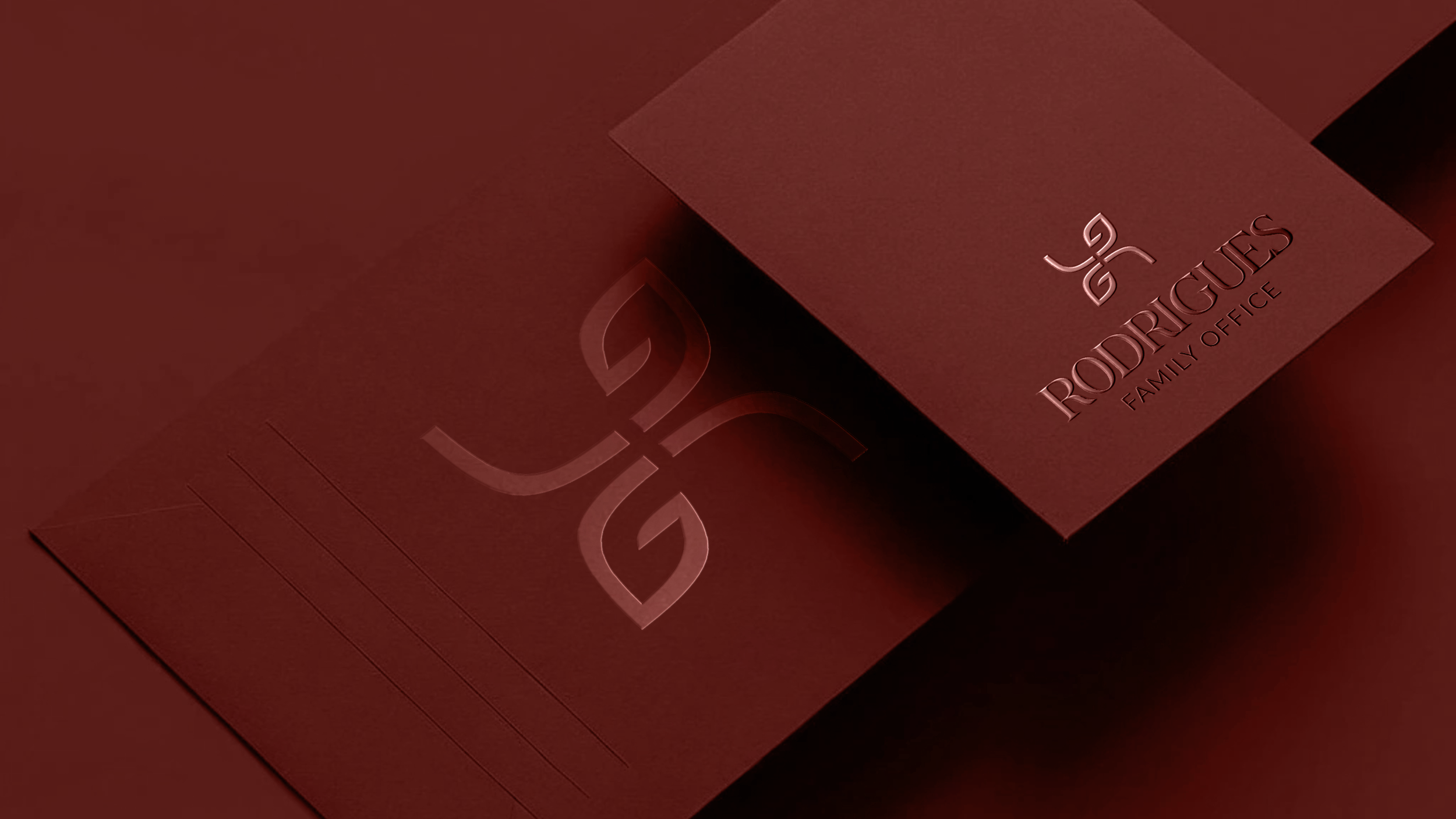
Archive Record 02.L&G Rodrigues Family Office
Developed the visual identity for a private family office, creating an elegant, timeless brand system across its physical and corporate touchpoints.
Art Direction & Brand Identity
Client: Luís e Graça Rodrigues
Role: Creative Direction | Brand Strategy | Brand Identity | Experience Design
Scale: Private Family Office
Project Type: Luxury Brand Identity
Date: September 2025
Location: Porto, Portugal
Status: Identity implemented - physical office under construction
Brief
Create a visual identity that reflected the clients’ values while communicating trust, discretion and sophistication.
Goal
Develop a timeless brand system that balanced luxury with professionalism across future physical and digital applications.
Challenge
Creating a distinctive visual identity from an open-ended brief with no predefined creative direction or visual references.
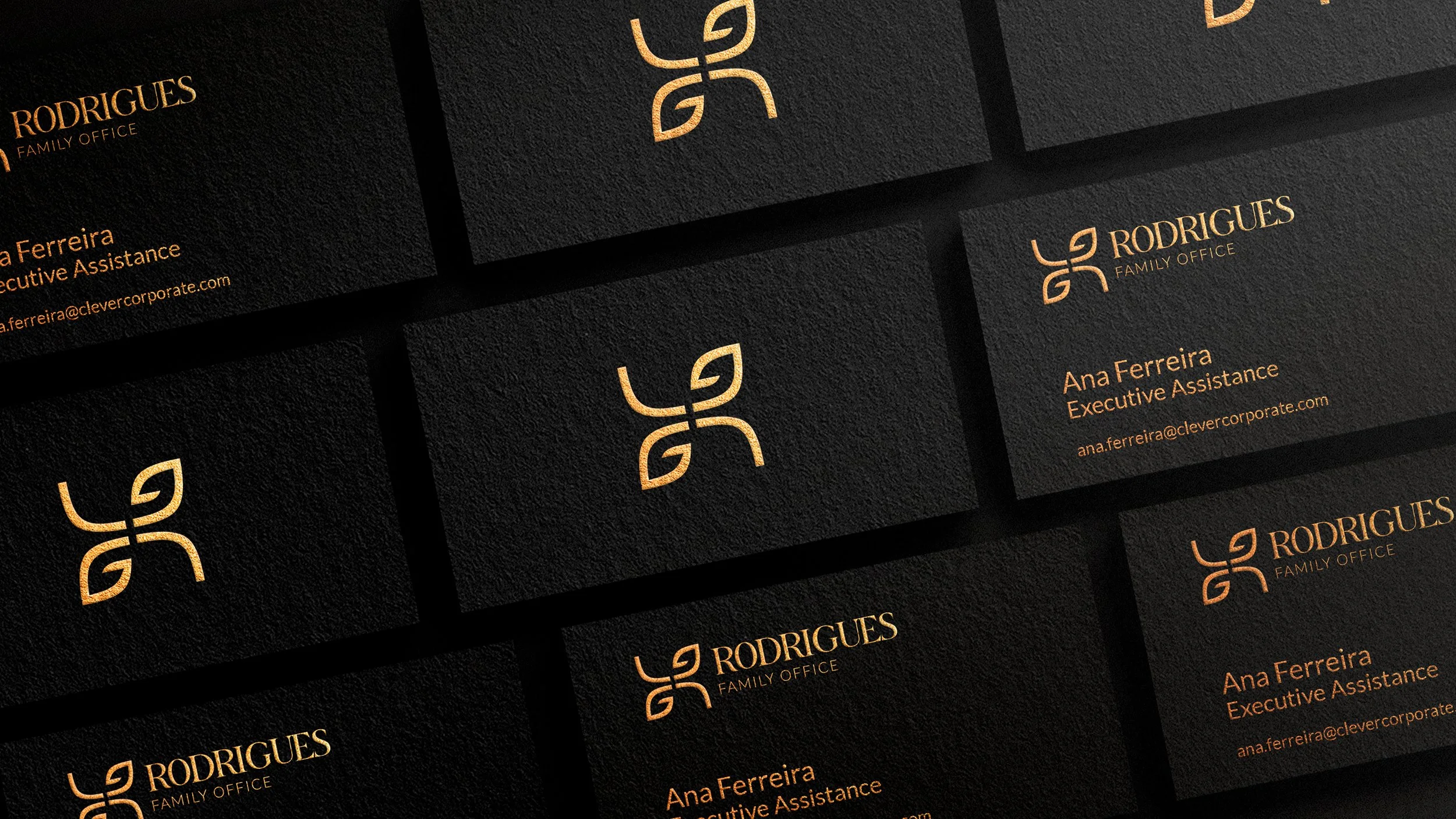
Creative Direction
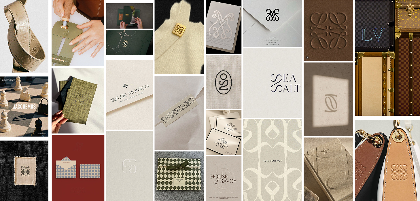
Research focused on the visual language of luxury, heritage and private wealth, exploring how typography, materials and restrained colour palettes communicate trust, discretion and timelessness.
The Monogram
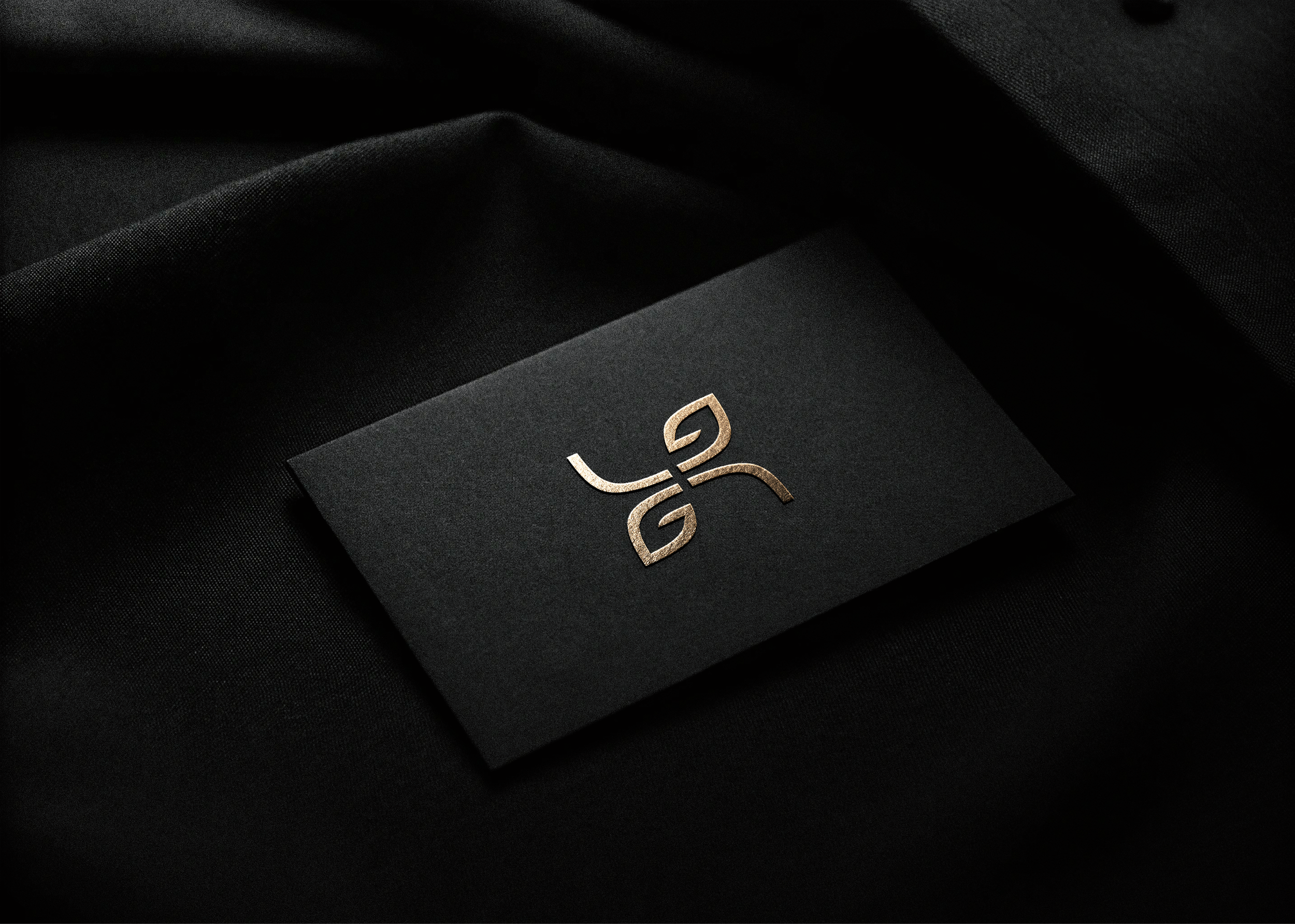
The identity is built around a bespoke monogram that represents both the family office and the family behind it. Designed to communicate trust, continuity and refinement, the mark balances timeless elegance with a contemporary geometric structure.
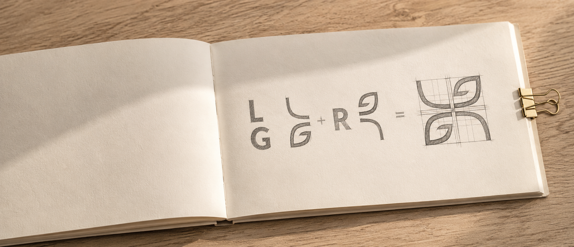
The symbol combines the initials of Luís and Graça and Rodrigues into a single cohesive form. The left side incorporates the L and G, representing the founders, while the right side forms the R for Rodrigues, creating a unified identity rooted in the family’s legacy.
The Logo
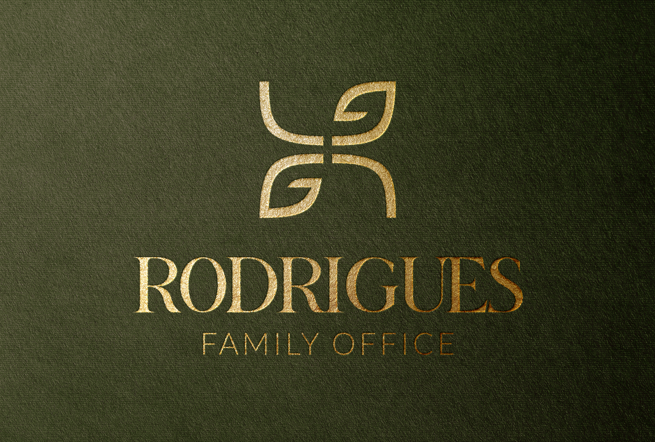
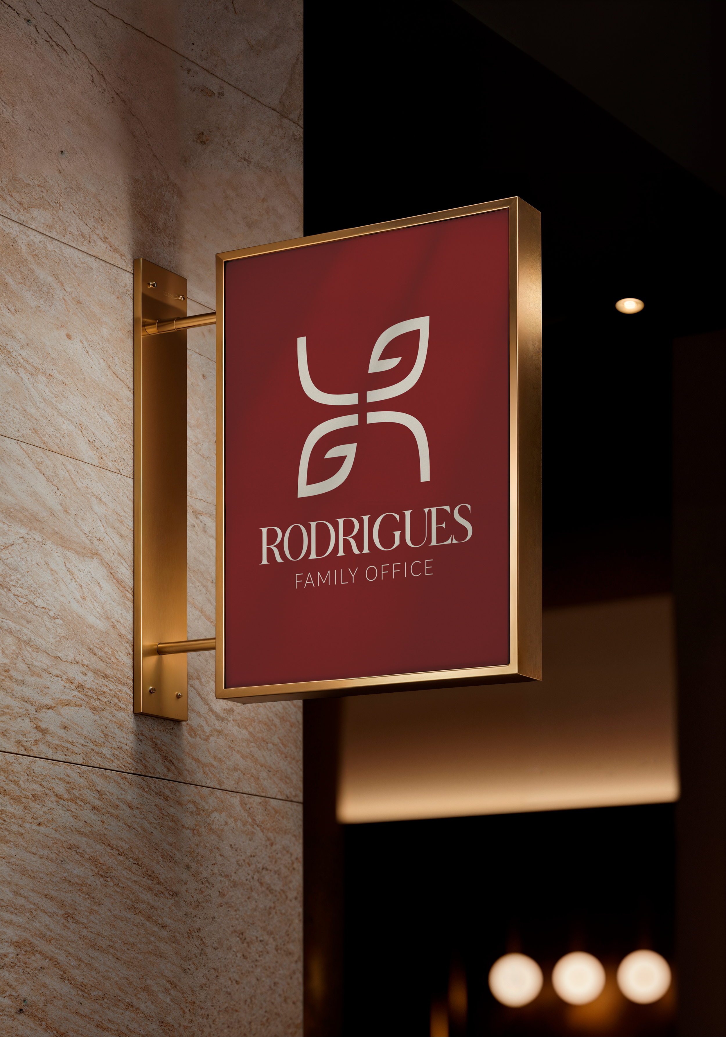
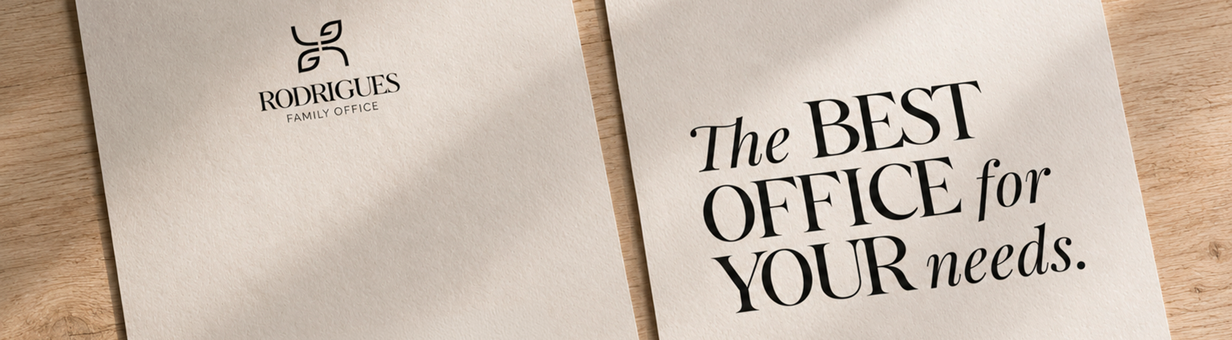
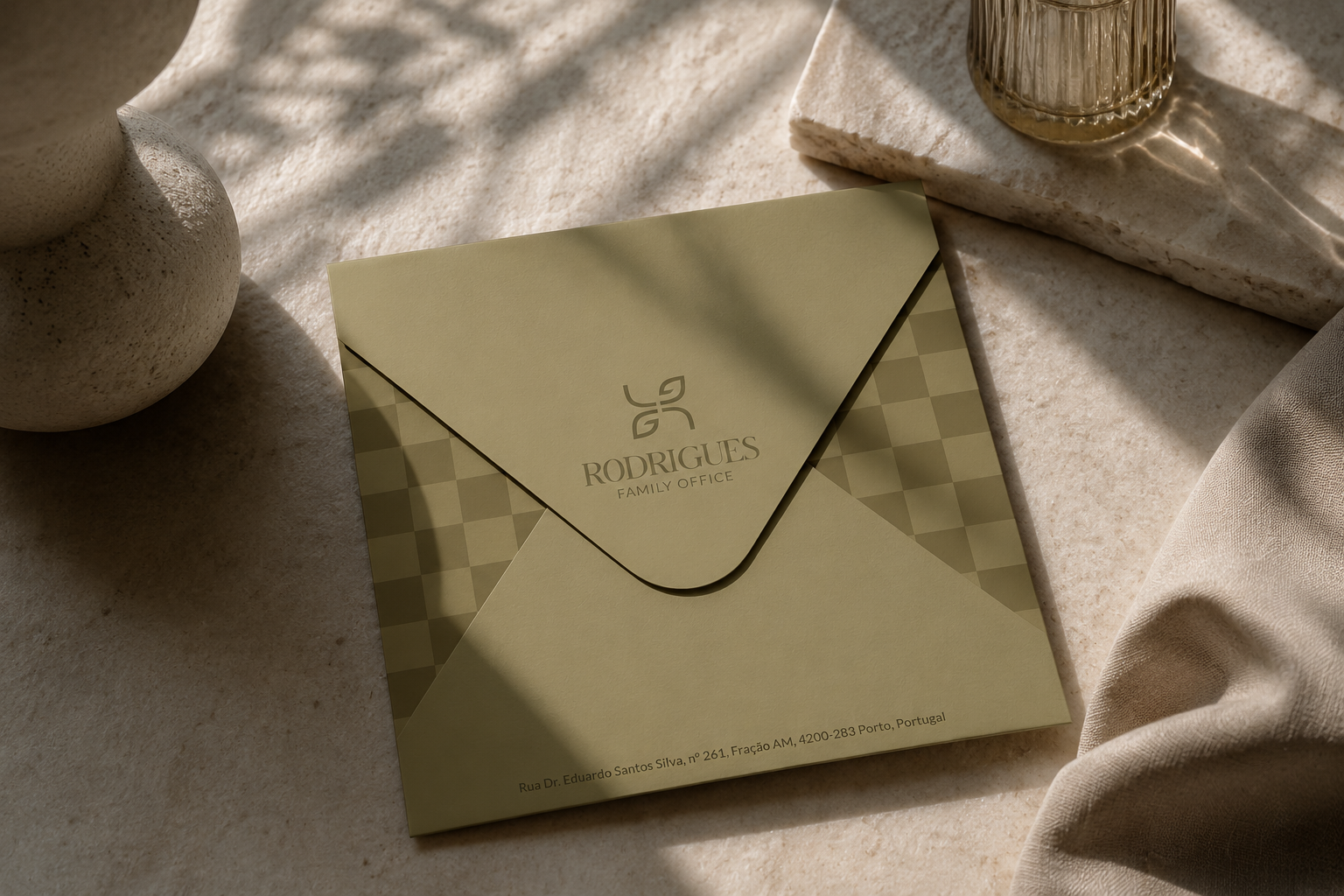
The monogram was paired with a refined wordmark to create a full logotype. A classic serif typeface was selected to reinforce the brand’s sense of heritage, permanence and sophistication, while the composition balances tradition with contemporary restraint.
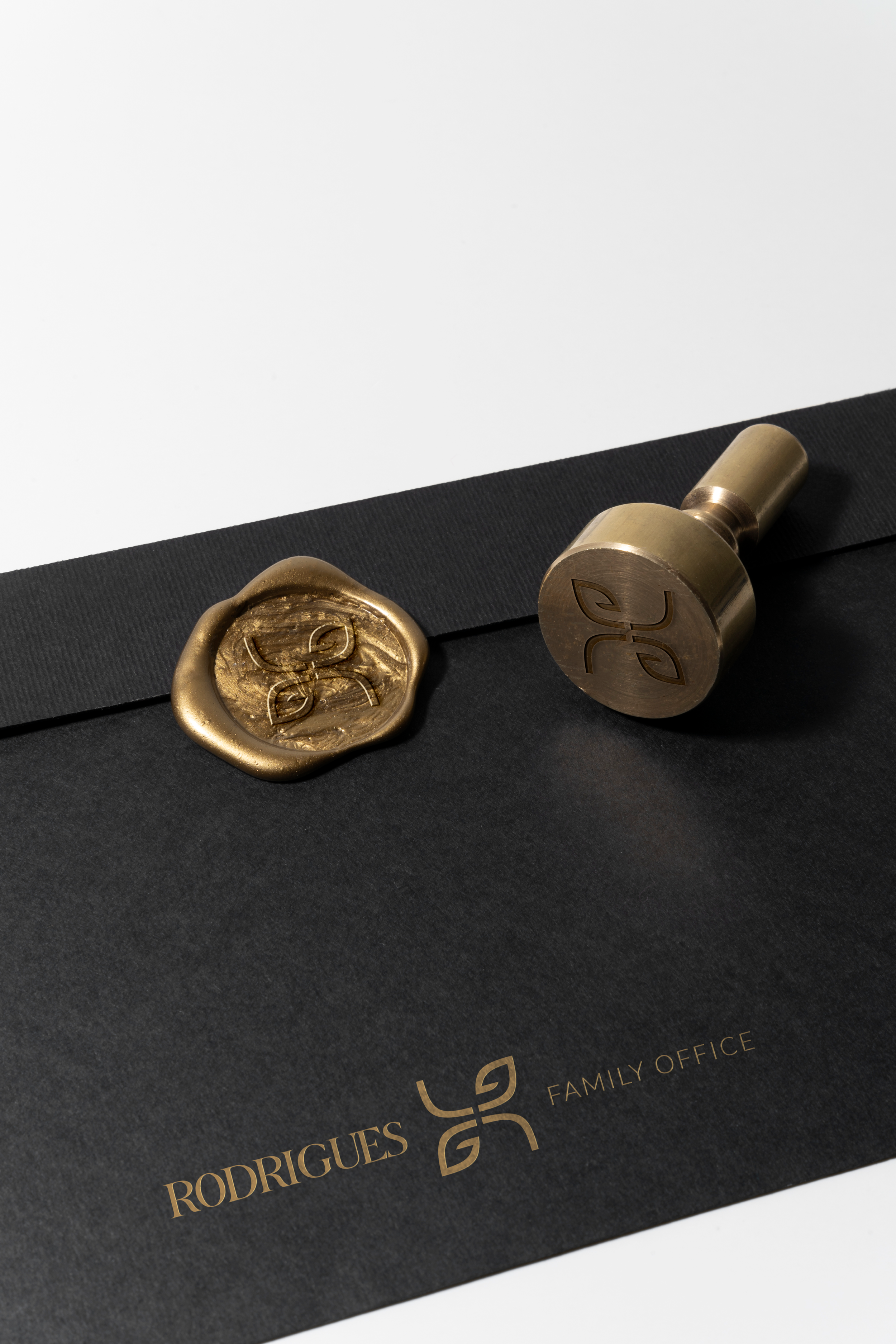
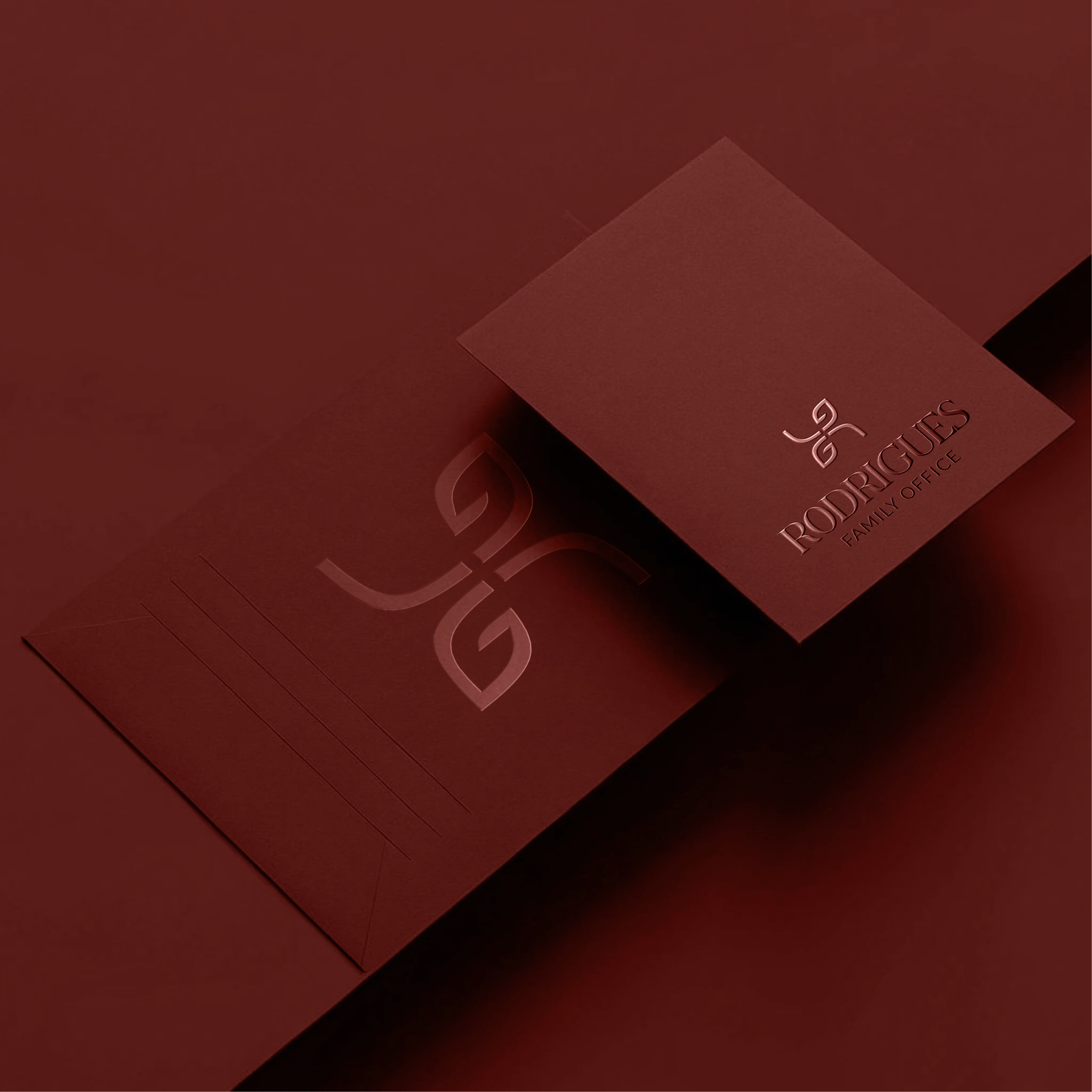
Secundary Logos


Typography System
The identity combines expressive display typography, refined editorial serifs and a clean sans serif to establish a clear visual hierarchy. Each typeface serves a distinct purpose, balancing character, elegance and functionality while maintaining consistency across every touchpoint.
Colors
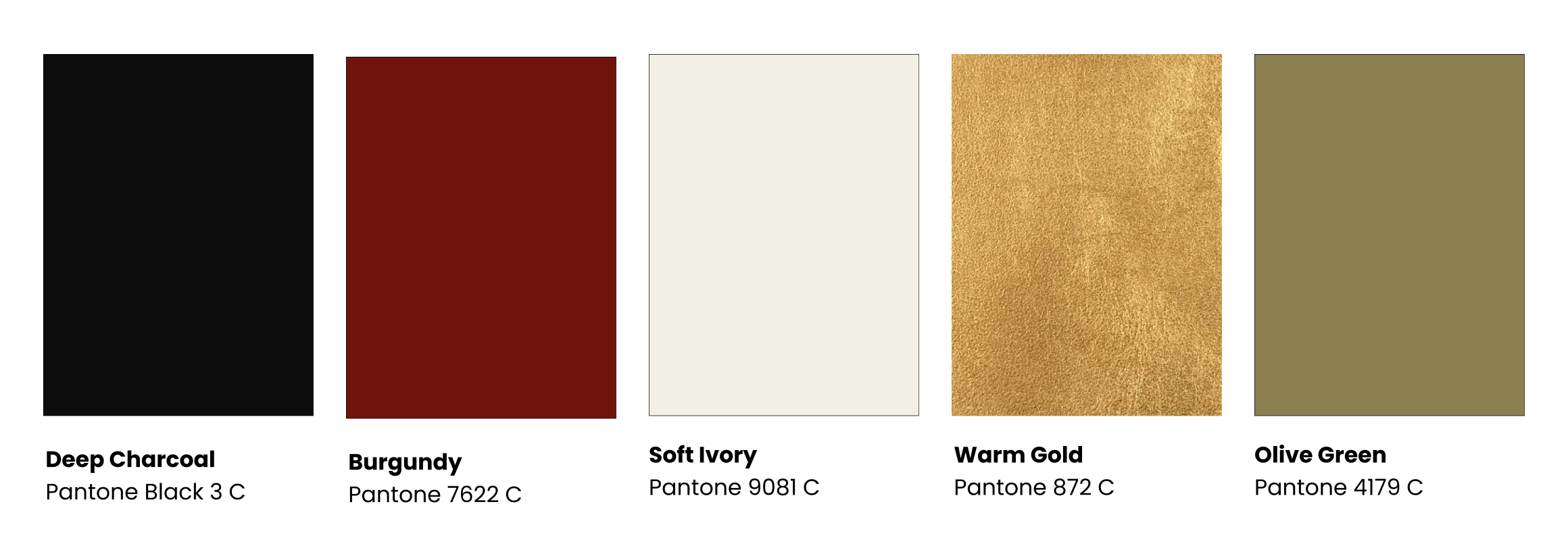
The colour palette combines deep charcoal, rich burgundy, warm gold, olive green and soft ivory to create a refined visual language rooted in trust, sophistication and longevity. Each colour was selected to balance elegance with functionality, allowing the identity to perform consistently.
Pattern System
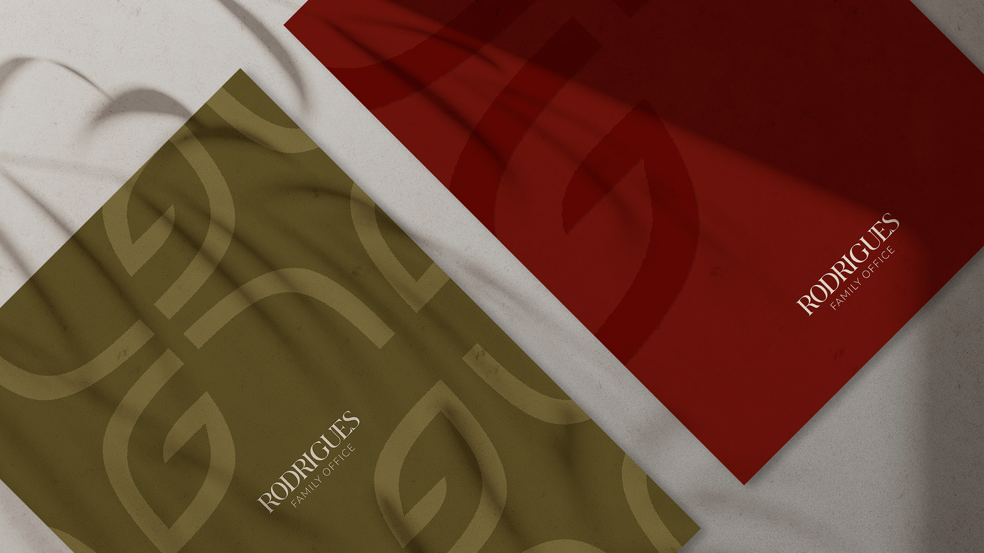
The visual identity extends beyond the logo through a flexible pattern system designed to enrich the brand while remaining rooted in its core principles. Two complementary pattern families were developed, each serving a distinct role within the identity while maintaining visual consistency across applications.
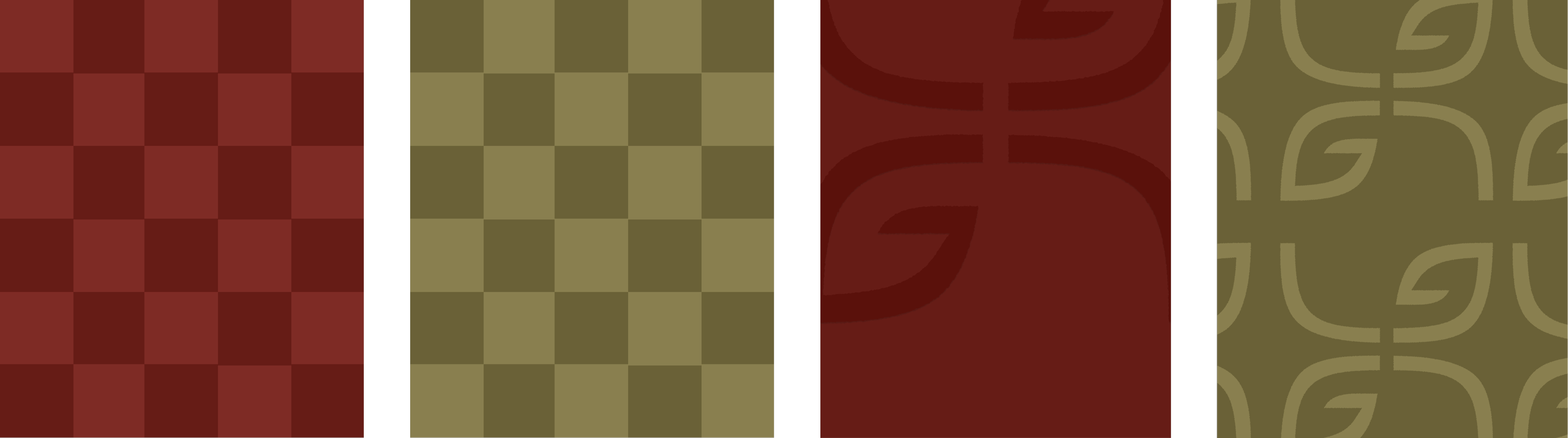
The checkerboard pattern references a long-standing visual language associated with heritage, craftsmanship and understated luxury. Reinterpreted trhough the brand’s colour palette, it introduces rhythm and texture while reinforcing the identity’s timeless character.
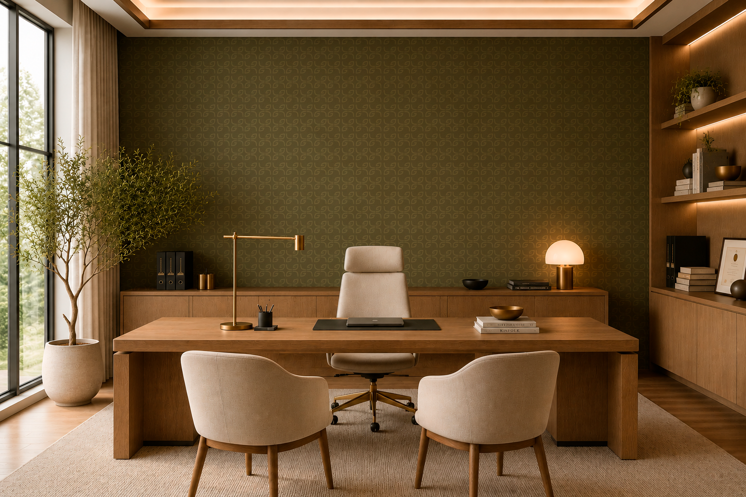
Alongside it, a bespoke monogram pattern expands the symbol into a repeatable graphic pattern. Derived directly from the logo, it creates subtle branded surfaces suitable for stationary, packaging and environmental applications without overpowering the overall identity.
Results & Impact
Client Approval:
The identity was approved in the first presentation without requiring revisions, demonstrating strong alignment between the proposed creative direction and the clients’ vision.
Brand foundation:
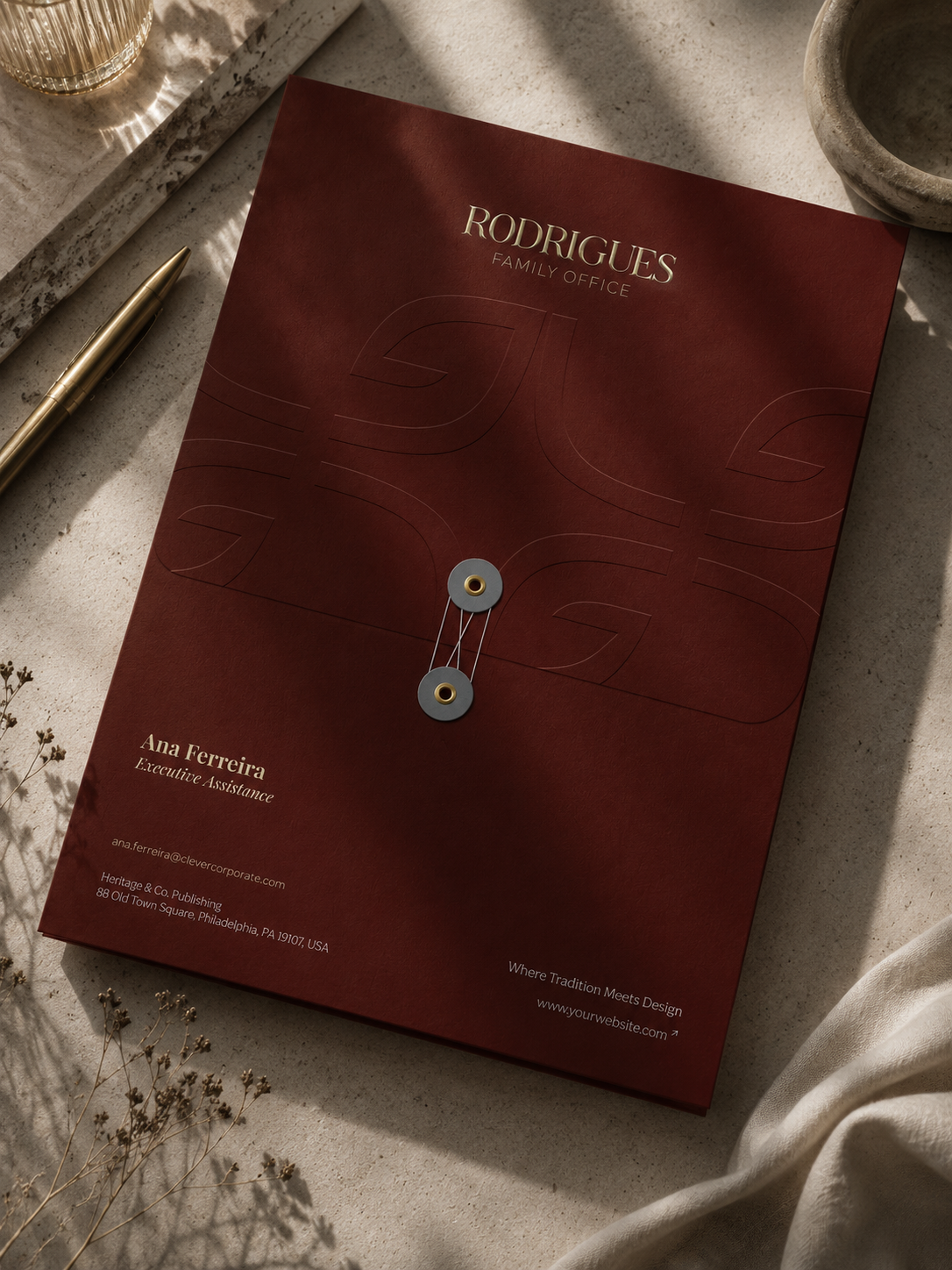
Established a cohesive visual identity that now serves as the foundation for the family’s office physical environment and future applications.
Long-Term implementation:
The identity is currently being implemented throughout the office space and branded materials, creating a consistent experience.